Translate

Monday 28 June 2010

Exhibition reviews - 24-25/06/2010

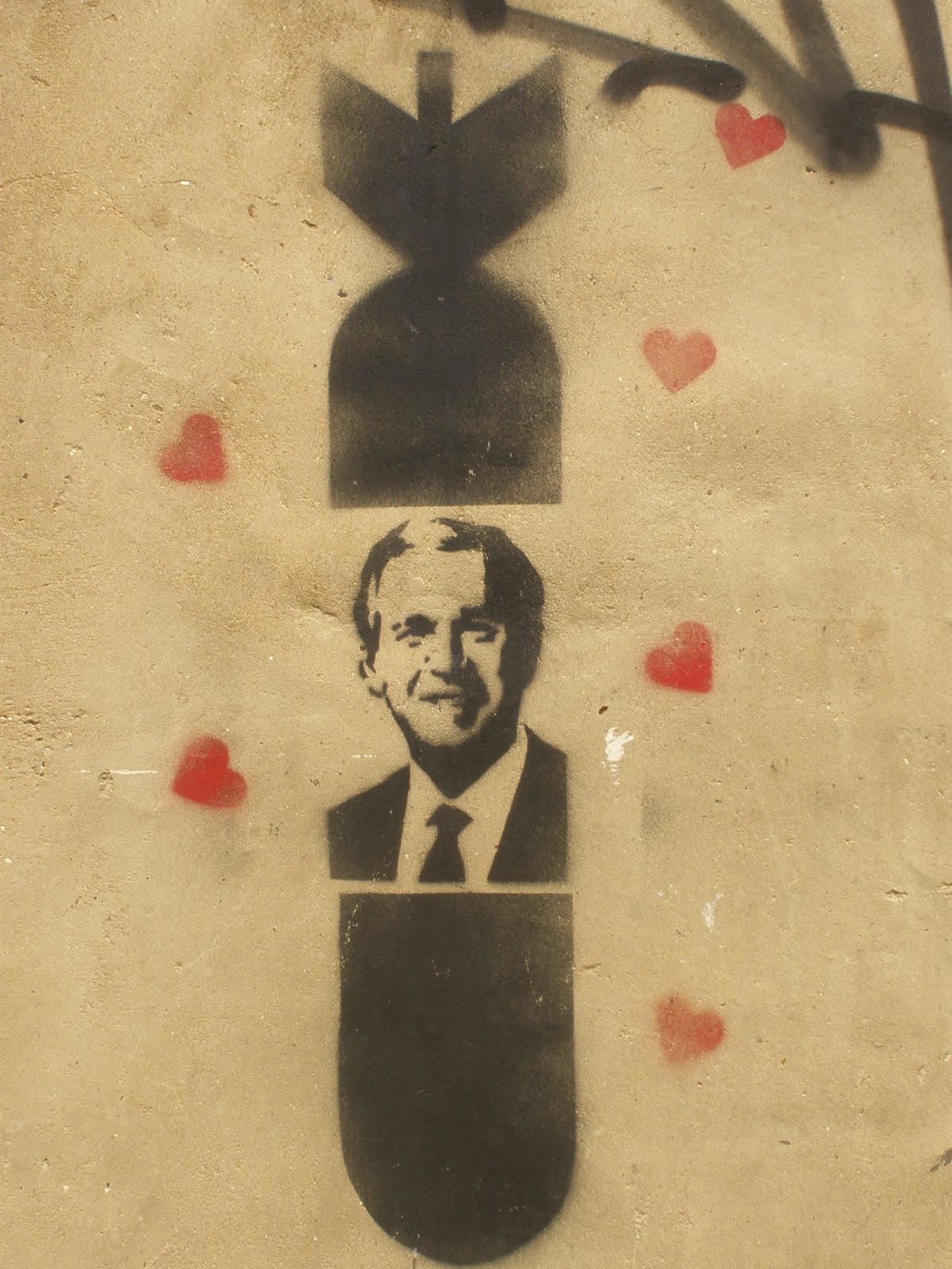
I had a busy evening last Thursday the 24th. I did mean to visit 4 exhibition openings, but only made it to 2 in the end.

The first I attended was at a small gallery called studio 1:1 at 57a Redchurch St. London, E2 7DJ. There were 9 artists in the show from Canterbury College, Kent. One of the artists was actually the tutor, Charles Williams, who contributed a bronze figure of a man that reminded me of Bully, the booby prize on the old quiz show, Bullseye - http://www.youtube.com/watch?v=W7RuorQhH7Q.

Here is the catalogue introduction by Helen Kirwan

Nine artists who met during their BA (Hons) Visual Arts Degree at Canterbury College, Kent, present this group show: eight are due to graduate this July; one, the artist Charles Williams, teaches there part-time.

Drawn together by mutual appreciation of each other’s work, the remarkable journeys made and challenges overcome, they express a high degree of commitment both to their own individual practices and collectively, to supporting each other.

It is tempting to find themes in group shows. However, the strongest impression here is of diversity, in the variety of subject matter and contexts, starting points and strategies and the range of materials- paint, video, sculpture, ceramics, mixed media and others.

Nonetheless, the content of the work is the element of greatest interest. Clearly, different ideas and issues have prompted the journeys of exploration and creativity of each particular artist. Thus one finds explorations of family photographs, memory and nostalgia; romanticism and landscape in the context of concerns about climate change; mapping and Euclidean geometry; the discrepancy between idealized images of females in popular culture and ‘reality’. An exploration of process and materials as such, is apparent in the use of clay; its manipulation, scarring, firing and glazing as expressions of the folds and caverns of the female body. Other experiments with clay, lead, wax, plaster and resin investigate the human face and head. In painting, intuitively, without overt, predetermined prompts or ideas, invented spaces with characters emerge.

To survive an ‘art world’ dominated by commercial interests, artists need to be sufficiently resourceful and intellectually resilient to hold onto their own ideas and values, when necessary, against the fashion-led values generated by the art market. [Jon Thompson, 2002]. Depth of understanding supports this strategy; one hopes and expects these artists will go on developing their ideas and capacity to hold their own values.

For a look at the artwork on display go to - http://www.wenickedit.co.uk/

I had the opportunity to interview one of the artists, Nathan Huckle, the video is below. I also had in-depth talks with Karen Baxter, whose striking piece resembled large clam shells stuck together, though what really struck me when I first saw it (and the reason I like it so much), is because it resembles withered labia. I engaged Karen on this and she had some very interesting things to say, though unfortunately I was a bit too drunk to record it! Sorry!

The other artist I spoke to after the show was the lovely Georgina Seltzer, who had her proud mum in attendance. Georgina's piece was a rather strange, but highly stylised portait. For more info on these, and the other artists go to - http://www.wenickedit.co.uk/

Interview with Nathan Huckle "Technical Issues" Alert! I'm having problems uploading this video to youtube. I will try again tomorrow!

The second show I attended was at the Outside World Galery, 44 Redchurch St. London, E2 7DP. This was chocabloc of artwork from all over the world. Pieces that struck me the most are below.


Bamos (from Tanzania) "Tinga Tinga"


Bamos (from Tanzania) "Tinga Tinga"


Bamos (from Tanzania) "Tinga Tinga"


Matthias Krumbiegel - Jazz Singers + Audrey Hepburn

I spoke to one of the artists, Mel Elliott after the show and Andy, an interloper in the best possible sense, started asking her quetions about her work. Below is the video that I filmed, so I aplogise for the dodgy camerawork. Mel was very engaging and really knew where she was coming from. The child-like quality of her work was definitely reflected in her personality and her stature, though I also got the felling that she is not the sort of person I would like to tangle with. I hope that when she reads this she won't mind me assessing her as a bit of a tough-cookie on the quiet.
I googled Mel's name and this came up from supermarketsarah.com - LOVE MEL products are designed by Mel Simone Elliott, a 36-year-old Artist/designer from South Yorkshire now based in East London. Having completed her MA in Communication Art & Design at The Royal College of Art in Kensington, she began working on the I LOVE MEL brand. Her work is heavily influenced by fashion, celebrity and interiors magazines and her passion for rebellion and fun lead to her playful products for adults in the shape of celebrity paper dolls (complete with suitable attire) and the 'Colour Me Good' range of colouring books. Love them or loath them, celebrities are unavoidable so why not dress them or get your crayolas out and colour them in?

I found Mel's work very engaging, in that the paper dolls were based on '70's craft ideals, though with a modern, even pop-art, slant. Her colouring books were more up my street, there were pictures to fill in of modern-day icons such as a topless Kate Moss and a disgraced Pete Doherty. I think they would bring a lot of fun to any dinner party.
Here is a pic of one of Mel's pieces to give you an idea about her style and sense of humour, though this one is not included in the show.


Here is the interview with Mel Elliott, with grateful thanks to Andy.


Interview with Mel Elliott

The show was very diverse, and you may know me by now, I usually have at least one criticism of exhibitions, and this one is no different. My real bug-bear about the "art world" is the business side of things, and I really find it quite off-putting when prices are displayed. This show did not go that far, though in the printed blurb there was only the name of the artist, title of the piece and then the price. I will write in more depth about this when I produce a mission statement in the near future, though I find this practice very cynical.
Open Fence, Altab Ali Park, London.

On the evening of Friday 25th I got a bit of a shock! At the southern end of Brick Lane there is a small (and very didgy) park called Altab Ali park, named after a man that was murdered in a racist attack some years ago.

The structure (pictured below) is a pop-up installation of a stairwell linking the street with the park near a bus stop where is no exit.
Here is an extract taken from their blurb.

Altab Ali Park is seperated from the street only by a historic wall, which is unusual as most public green spaces in that area are surronded by fences and gates. Besides many people use a short cut through the park, jumping over the wall, to get to the adjacent bus stop. The project stresses out the already existing qualities of the wall as an open boundary. A wooden structure, which sits on top of the wall, connects the street area with the park and enhances the accessibility of Altab Ali Park. The project refers to the Gestalt of sand dune fencing. The fence originally an seperating element is transformed into its opposite. Taking into account the historic value of the wall, the structure will only touch it, no fixtures at the wall are necessary.

Have a look at the pictures


The Innsbruck Students have another 2 years left on there course and as I mentioned at the end of the interview, the only criticism is about the ergonomic usability of the structure. When walking up the stairs, I expected to be able to walk through a gap at the top and to be able to walk down stairs on the other side, instead of having to jump down on the other side. This is a learning curve for them though and I hope that pointing this out, they will take this in and improve for the future. The structure is amazing and even more so on first sight, it certainly created a lot of interest from passers-by.

I'm geting hooked on interviewing! Here is yet another interview with 3 of the the artists (although they are actually Architecture students), Thomas Hildebrand, Bob Simon and (a silent) Cornelia Vonbun, and their tutors Birgit Brauner and Christian Schmutz.
"Technical Issues" Alert! I'm having problems uploading this video to youtube. I will try again tomorrow!
Coming soon: Mission statement for Brick Lane Arts and more exhibition reviews.
mancpete

Friday 25 June 2010

2 new exhibitions

Last night I attrended 2 new openings, though there was another 2 nearby but I didn't manage to make it to them.


The first was The Studio 1:1 Gallery at 57a Rechurch St. at the northern end of Brick Lane. The artists showing there are Canterbury College BA graduates. All the work was excellent and a number of pieces


Thursday 24 June 2010

More pics... New and Old

One of the things I love about Brick Lane is that there are always surprises for you. I thought I kenw all the artwork around there, having lived there for a few years, then I discovered some more gems that seem to have been there for ages. Have a look...


I know, I know! Too cute, but Fantasia is one of my favourite films, and quite scary for a child!

My sentiments exactly! I think it looks like Debbie Harry. Do you agree?


... and there are some dark arts abroad!
These are ingenious. I like the way they create an artificial shadow, even at night! I think the artist is trying to say someting about the light being fragile and we should meake better use of it. That's my opinion anyway, maybe you could comment on them as well?


This of Che Guevara is great, The artist has deconstructed his persona by deconstructing the face of the hero.

Look closely at who's driving the cars with a pistol.
And here are some brand new ones that only been added in the last 2 or 3 days!


The traffic around Brick Lane is awful (there is the City of London close-by, also 3 major tube stations) and this seems to be some kind of protest about it.

These are dark! WOW! They are by Nathan Bowen, who did ithe earlier piece "After-Lives"
There are still so many to show you but I want some feedback, so that's all for now folks!!
Coming soon: reviews of this weeks opening shows and interviews with artists
mancpete

Wednesday 23 June 2010

The Foundry – R.I.P.

East London venue The Foundry is to be demolished and replaced with an 18-storey hotel. The music and arts venue was closed 2 weeks ago, though squatters moved in immediately.

I have been here a lot of times and always had a great time and viewed some great artwork. The venue was also a favourite with the bicycle couriers that are based in and around the City of London financial district, and the Old St. area. The last I was there I had a great night with some friends that I just ran into by chance after not seeing them for about 6 months. It was that kind of place; you could go there on any given evening and see people that you had lost touch with for on reason or another.

Over the past decade the venue on Old Street has played an important role in the history of acts including Hot Chip and The Libertines, as well as the likes of author Irvine Welsh, comic Mark Thomas and graffiti artist Banksy. It was co-founded by Bill Drummond, formerly of The KLF.

Hackney Council approved plans to knock it down in February, despite protests from owners Tracey and Jonathan Moberly, who were expected to be evicted from the property by April.

Before finding fame, Pete Doherty ran a poetry night called Arcadia At The Foundry at the venue, and also included a flyer for an early Libertines gig there in the sleeve of the band's debut album, 'Up The Bracket'.

Despite opting to close the venue, which regularly hosts live music and art installations, Hackney Council has agreed to save a six-metre high Banksy mural on the building.

The Moberlys are currently in talks with the Tate Modern about relocating The Foundry's graffiti covered walls, which include scribblings by street artists including Banksy and Faile, as well as numerous bands and drinkers.

The venue has been taken over by squatters, who are in court on Thursday 24th June, and here’s a link to their website:
http://84greateasternstreet.tumblr.com/#me

The mission statement of the squatters reads:
“The Foundry was a free accessible space that hosted a variety of arts and music events.

The building will be levelled by Park Plaza who intend to build a an “Art ‘Otel” in its place, sweeping away the DIY culture that has been built over many years and by many people. This luxury hotel will capitalise on a sanitised imitation of what was, selling sub-culture tourism at a premium.

This process of gentrification has forced out our disenfranchised inhabitants of the area. Our creative potential is being sacrificed to a political system that pursues profit through cultural demolition.

In defiance of the destructive forces of the market we assert our right to culture and community though the occupation of this building and the creation of a free and open space”

Heady and high words indeed, but will the powers-that-be listen to them? Sadly, from experience I think that the “cultural squatters” will be out on their ears lickety-spit, barring a major victory in court.

I went past The Foundry the other day and saw that it had been taken over by squatters. While reading a huge print of the above mission statement and legal warning, I spotted a police officer reading them, here’s a pic. It made me chuckle!


Go to http://84greateasternstreet.tumblr.com/#me for more info and if you want to join the campaign to save the venue. Also, make sure you look at the archive, as it has some artwork and flyers for the venue over the years.

Coming up: Reviews of this weeks openings and more pics of the artwork on and around Brick Lane.

mancpete

Monday 21 June 2010

Some More Pics

Here are more pics from the Brick Lane area.


These are all great pics, and there are sooooooooooo many more to show you.
Coming up: A report on the closure and squatting of the famous alternative art gallery, performance space, bar and general hang-out The Foundry.
Also: The opening of the Modern Toss exhibition at the Maverik gallery on Redchurch St.
mancpete

Friday 18 June 2010

"Some People Are On The Pitch"

For any fan of England these words are immortal. They were spoken by Kenneth Wolstenholme, the legendary commentator, towards the end of the World Cup final in 1966, just seconds before Geoff Hurst scored the third goal. If you want to know more about this then go to http://www.youtube.com/watch?v=RE-wKAooU20

The night before the exhibition me and Susana walked past the gallery and saw what looked like childish scribbles on paper in the window. We both agreed that this is not art and a 5 year-old child could do better. We attended the opening the next day anyway, and were pleasantly surprised by what we found inside. Firstly, I have to explain that I'm a football fanatic, though Susana hates the game, but even she was fascinated by what she saw. I'll let the artist explain his creations for himself. There are then some pictures of the exhibition, then there's an exclusive live interview with David from outside the gallery.


Here is the blurb for the exhibition (which has now finished) from the website of the artist, David Marsh.

'Some People Are On The Pitch'

The project traces the movement of the players throughout the 1966 World cup final between England and West Germany to create a 'portrait' of the nation's most treasured sporting victory.

Created by mapping archive footage at 1/2 real speed, using the pitch markings and the stripes of the cut grass as a coordinate system, the work follows the movement of each player against time, on and off the ball, as they move across the 'field' of play throughout the full 90 minutes, plus extra time.

The recorded information is then coded through a system of line type, weight and colour to allow the narrative of the recorded information to be represented and read graphically, producing a work simultaneously latent with an immense level of information, and one seemingly abstract in its aesthetic.

The exhibition consists of each player's individual traces, split into playing segments, and culminates in a final piece which combines the full team, stitched from the same material as the famous red shirts worn by England in the final, and black to represent the Germans, to form a 'match portrait.'

Here are some pics of our favourites pieces


And here are some pics from the exhibition that Susana took


David is in the middle in the above picture


And, as promised, here is the interview with David Marsh, the first in a seies of interviews with the artists


It's a shame that this exhibition is over, but from now on I'm gonna be more on the ball (geddit?) and keep this blog more up-to-date.
Coming soon: I'll be uploading some more pics of the street art soon so keep an eye out for that. Plus, more exhibition highlights next week.
mancpete

Friday 11 June 2010

On Tuesday night me and my colleague Susana went to an opening of an exhibition at Concrete Hermit which is on Club Row at the northern end of Brick Lane. It was very interesting as the Graphic artists were commissioned to re-interpret work by other artists who used more "traditional" methods like painting. There were several striking pieces and I collared Ed Taylor who, for me, had contibuted the best piece. This was a reproduction of a painting by an artist called Von and was a stark close-up of the eyes of an Owl.

I asked for an interview and told to email them with some questions. I was quite perturbed by this and wrote down the answers to the questions I did manage to ask straight after meeting Ed. I emailed their publicist anyway with some (rather good) questions and received a reply that they were far too busy and was sent a press release instead (below).
Here's the image that really got me. Unfortunately, I can't find a picture of the original work, but I'll email Von and Ed to try to get the original.


JOINING FORCES: TAYLOR JAMES COLLABORATIVE IMAGE MAKES EAST LONDON GALLERY DEBUT

Exhibition: 9-30 June 2010, Free Entry

Venue: Concrete Hermit, 5a Club Row, London E1 6JX

Creative production studio Taylor James’ latest creative effort, formed from the cross-pollination of illustrator and CGI Studio, is to be showcased at the Concrete Hermit Gallery, East London, 9-30 June. Aptly titled ‘Joining Forces’, the exhibition includes work born from partnerships between six esteemed image-makers and a CGI/post-production companies, commissioned by Creative Review for its June CGI special. The six page feature was designed to demonstrate the creative capabilities of CGI outside of photorealism and Taylor James’ image also graced the issue’s cover.

Taylor James’ striking image of an owl is a collaborative piece between one of its creative leads, Ed Taylor, and illustrator and artist, Von, and was chosen to grace the cover of the coveted magazine. Taylor James was pleased to take up the invitation to participate in the magazine’s annual CGI issue with such a unique concept. Creative Review said ‘We ran our first CGI special issue last July. In it we talked about the fact that, although CGI is a great photo-realistic problem-solving tool, it might be more interesting to see what use the technology could be put to in creating new kinds of imagery. So, for this issue we picked six illustrators/designers, most of whom have a hand-drawn aesthetic, and matched them with six CGI studios. We asked each pair to come up with one image which would represent a synthesis of their skills.’

Taylor James has been at the forefront of creative visual content creation for over ten years, specialising in print, interactive and broadcast media. Having CGI, retouching, photography and live action services all in-house enables the studio to offer a broad spectrum of innovative solutions. Ed Taylor said “CGI offers unlimited creative possibilities, there is no inherent style born out of the discipline. The most important thing is creating an aesthetic that most effectively solves our client’s brief.”

Given the editorial time constraints, a previously completed piece of Von’s work was selected from his website, www.hellovon.com as inspiration. Von had seen Taylor James’ step by step guides of projects at www.taylorjames.com and liked the juxtaposition between photos taken and the 3D/CG elements being added before the image was fully rendered. Von (www.hellovon.com) explained “we went with a drawing of an Owl I did in 2008 because it already had a very angular 3D feel which provided a great starting block for Taylor James to do their magic.”

Ed Taylor explains the creative development process: “I wanted to make the original image come out at you by introducing some subtle but dramatic lighting but without making it too over the top. I didn’t want the piece to be typically 3D i.e. with highly convincing form and shading...and I certainly didn’t want it to be a demonstration of “fancy shaders” chromes, HDRI reflections, or any kind of gimmicks.”

With the introduction of subtle 3D elements and delicate lighting and shadows, the abstract forms in the original have been embellished with translucent feathers. Two final versions were used and will be shown at the exhibition; a de-saturated tonal image, true to Von’s original and a bolder colour version with brilliant eyes.

This exhibition is a first of its kind to be commissioned by Creative Review in conjunction with their CGI special. The final results are experimental and stunning examples of how a combination of artists can work together with pioneering technology to create new and exciting imagery.

All in all, it's a pretty good read and gives a lot of insight, though I would have liked a more personal view from the artists in question. Here is a copy of the questins I sent to them

Firstly for Ed

Usually, when I go to exhibitions I see original artwork. What are your thoughts on changing another artists work?

Do you think that Von could reproduce a piece of your work and do it justice?

For Von

Can I ask the same questions but in reverse? What are your thoughts on having your work re-interpreted by another artist?

Do you think Ed's version of your piece did it justice?

For Ed and Von

I read the interview in the magazine and thought it sounded a bit contrived, like you were being very guarded. Is there anything "controversial" that you could add to spice things up a bit?

I loved the work and the "feel" of the exhibition, the only criticism I would level is that the original works were not on display. Was this because you wanted the CG works to stand as pieces on their own? Or is there another reason?

As I said earlier, I didn't get a reply to these questions, I got the press relaease instead, but these are the kind of questions I want to ask and if I get replies I will publish them.
I did manage to write down some answers to questions I did get to ask. Here they are:
mancpete - How much for the Owl piece (I always want to know this, and will ask it as often as I can because I want to know about the motivation of the artist)
Ed Taylor - I never really thought about that. (Bravo Ed, I really like that answer!)
mancpete - I usually get to see the original artwork. What do you think of re-imagining another artists work?
Ed Taylor - No reply (I was a bit disappointed about this as Ed had gone into some detail aabout his in our earlier conversation)
mancpete - Why aren't the original versions here alongside the CG versions?
Ed Taylor - I think they missed a trick there. I don't know why they're not here. They should be. (Totally agree Ed!)

Have a look in the gallery if you're in the aera, or if not you can go to the respective websites and see for yourself.

Coming soon: Review of last nights shows and an exclusive interview with Christopher Lakony

mancpete

Police swoop on gallery after passer-by spots a bomb... but it’s really an artwork

This is absolutely hilarious. It's not about Brick Lane, I thought I'd show you the paranoia of the police state in Britain absurdity and absurdity of the art world. You gotta laugh!

http://www.thisislondon.co.uk/standard/article-23843771-police-swoop-on-gallery-after-passer-by-spots-a-bomb-but-its-really-an-artwork.do

mancpete

Thursday 10 June 2010

More Pictures

I've only shown you a fraction of the work on and around Brick Lane. Here's a few more


This is one of my favourites. Spirals are great and I like the way that these 2 are in inverse patterns. Unnamed courtyard off Brick Lane


This makes me smile, not because it's any good, but because it's quite absurd. Unnamed courtyard off Brick Lane


I never used to like stencil work, though more recently this artform has become more sophisticated. I mean in the sense that the ideas behind the (sometimes) basic technique are being expressed more succinctly than in some other mediums that involve a lot more work and (sometimes) a lot less creativity. I think this clown looks a bit like Morissey from The Smiths.


Another of my favourites. A good twist on the Monkey Say, Monkey Do slogan meaning: People who do whatever everyone else is doing, regardless of the circumstances. I'm not sure if that cat on a tile is part of the original design, but it doesn't detract too much from the piece.


I'm not sure if this is one piece or two, but good work on both counts. Two things though: - What are UFUS? and why are those red arrows there? Answers on a postcard please, to...


I'm not usually one for cutesy stuff, but I have always loved Betty Boop! Sexy! I wonder if it's dedicated to Lulu?
This is only a small selection of the artwork around Brick Lane. I have a lot more for you.
Remember, there will be some exhibition reviews coming soon, including interviews with artists.
Please leave your comments at the bottom.
mancpete

Wednesday 9 June 2010

"Technical Issues" resolved!

Hey! Now I'm gonna let the artwork do (most of) the talking! Just to let you know though, I have given the names of the pieces based on what I see. These are not the official names. Unless stated next to the piece they are situated on Brick Lane itself.


"After Lives" and "Schwartz" at the corner of Osborn St. and Brick Lane.


Have you seen those t-shirts "I HEART BUSH"? Hilarious! The Yanks don't even get the joke.


Unnamed courtyard just off Brick Lane. Just goes to show - Pop Art is alive and well.


Jimi Hendrix - Hanbury St. just off Brick Lane


And there's even some Surrealist stuff around here. Unnamed courtyard just off Brick Lane


This Stork was reported in the London Evening Standard as being 12 metres tall. The man in the foreground was nearly 6 feet tall, so that will give you some idea of the scale of this piece. Unnamed courtyard off Brick Lane.


And I love these little guys! They remind me of tourist penises!


There are some great graffiti styles...


And some that are not so great!
I've got so many more to show you, but I want some feedback on what you think so far. Please leave me a message telling me what you (honestly) think.
Coming soon: Reviews of gallery shows I've been attending and interviews with the artists involved.
Later this week/early next week: interrview with local artist Christopher Lakony. Go to google and search his name.
See ya soon!
mancpete